How to Choose the Right Colours for Your Brand
Choosing colours for your brand is rarely about preference.
It’s easy to pick something that looks good in isolation, but brand colours don’t live in isolation. They appear across your website, social content, printed materials, and every interaction someone has with your business.
The goal is not to choose colours you like. It’s to choose colours that communicate the right message, feel consistent across every touchpoint, and make your brand easy to recognise over time.
That requires a bit more structure than simply selecting a palette.
Key Takeaways
Choosing brand colours should be guided by positioning, audience perception, and how the business wants to be experienced rather than by personal preference alone.
Strong colour palettes are usually simple and structured, using a combination of primary, supporting, accent, and neutral colours that can remain consistent across websites, social content, print, and other touchpoints.
Colour associations can influence perception, but context matters more than rigid rules because the same colour can communicate very different things depending on tone, saturation, pairing, and application.
Effective brand colours need to function practically as well as visually, maintaining readability, contrast, recognition, and consistency across different devices, environments, and long-term brand usage.
Start With What Your Brand Needs to Communicate
Before looking at colours, it’s important to define what your brand should feel like.
Not in abstract terms, but in a way that can guide decisions. Words like “premium,” “approachable,” “technical,” or “bold” start to create a direction. Without that clarity, colour choices become random and difficult to justify.
For example, a business that wants its brand identity to feel established and reliable will naturally lean towards a different palette than one aiming to feel energetic or disruptive. The same applies across industries, audiences, and positioning.
This step is often skipped, which is why many brands end up with colours that look fine but don’t actually support how they want to be perceived.
Once the personality is clear, colour becomes a translation of that intent.
Use Colour Associations Carefully
Colour does carry meaning, but it’s not as rigid as it’s often presented.
Certain patterns do exist. Blue is commonly associated with trust and stability. Green often suggests balance or growth. Warmer colours like red or orange can create a sense of energy or urgency.
These associations are useful, but they shouldn’t dictate your decisions completely.
Context matters more.
A deep, muted blue can feel premium and controlled, while a bright, saturated blue can feel more modern and accessible. The same colour can communicate different things depending on how it’s used, what it’s paired with, and the overall design.
The key is not to follow rules blindly, but to ensure the palette feels aligned with your positioning and audience.
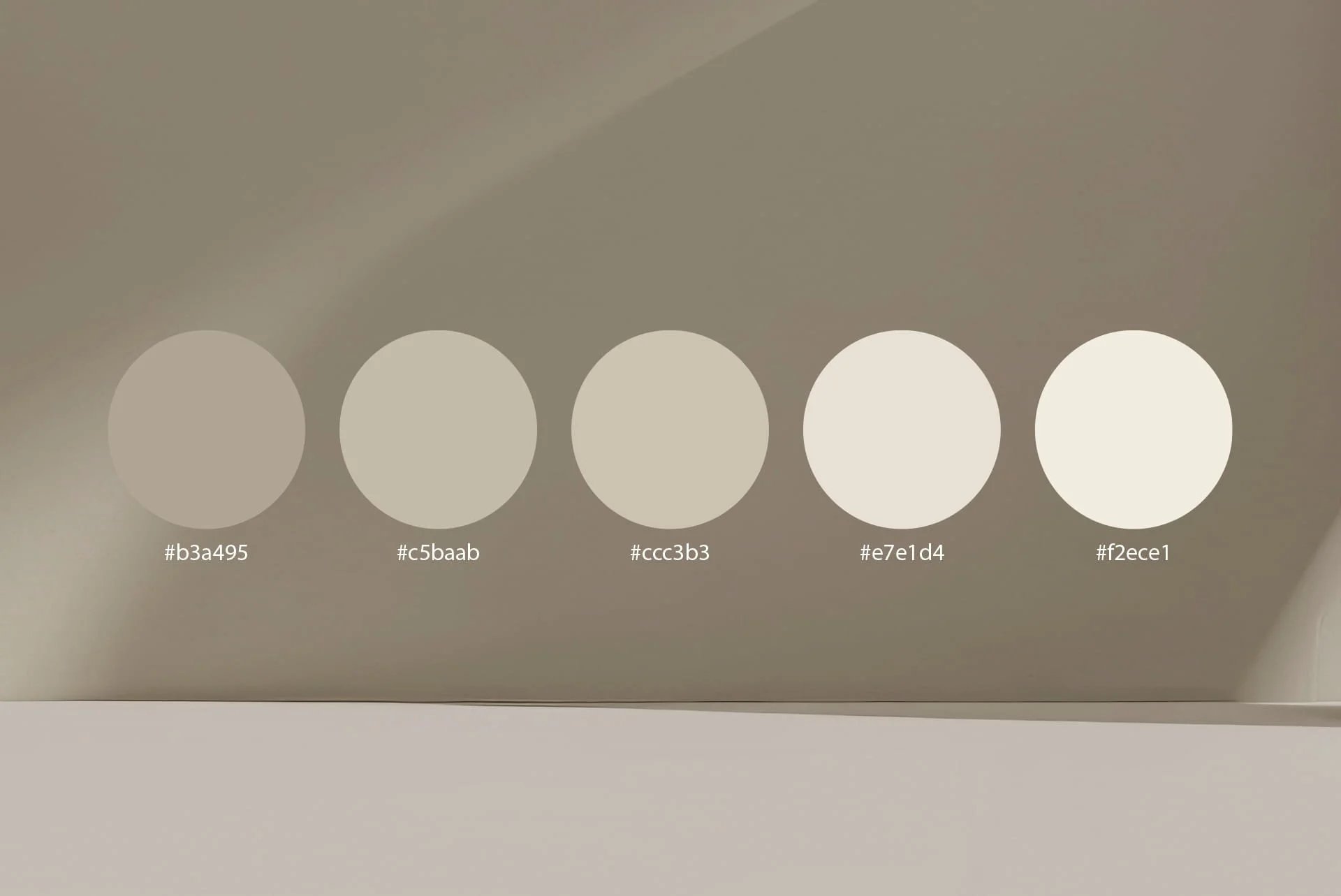
Build a Palette That Works in Practice
Strong brand colour systems are usually simple.
Rather than using a wide range of colours, most effective brands rely on a small, structured palette that can be applied consistently across different formats.
Primary colour
This is your main brand colour, the one most closely associated with your identity. It often appears in your logo, key headings, and major visual elements.Supporting colours
These add flexibility without overwhelming the design. They are used for backgrounds, graphics, and secondary content, helping the brand feel more complete without losing focus.Accent colour
This is used more selectively, often for calls to action or highlights. Its purpose is to stand out, not to dominate.Neutral tones
Whites, greys, or darker shades provide balance. They make content readable and allow your main colours to stand out more effectively.
This structure is what makes a brand scalable. It ensures that whether the colour appears on a website, a social post, or a printed piece, it feels consistent.
Make Sure It Works, Not Just Looks Good
One of the biggest mistakes is choosing colours based purely on appearance.
A palette might look strong on a moodboard but fail when applied in real scenarios. Text becomes harder to read, buttons don’t stand out, or contrast is too low to guide attention properly.
This is where usability matters.
Colours need to work across different conditions. On websites displayed across different screens, in print, on mobile devices, and even in low-light or high-glare situations. They need to maintain clarity regardless of where they appear.
A simple test is often enough. If text is difficult to read or key elements don’t stand out immediately, the palette needs adjustment.
Good colour choices support clarity. Poor ones create friction.
Think About Consistency Over Time
Colour is one of the fastest ways people recognise a brand.
But that only works if it’s used consistently.
If colours change across different platforms, or if variations appear without structure, recognition weakens. Over time, the brand becomes less distinct, even if the design itself is strong.
This is why colour decisions should be documented and defined clearly in brand guidelines.
Not just which colours to use, but how to use them. Where they appear, how they combine, and what should be avoided.
That consistency is what turns a palette into an identity.
Where Most Businesses Get It Wrong
The most common mistake is treating colour as a creative decision rather than a strategic one.
Businesses either choose colours based on personal preference or follow trends without considering whether they align with their positioning.
Another issue is overcomplicating the palette. Too many colours create inconsistency, making it harder to maintain a clear visual identity across different channels.
In both cases, the result is the same. The brand lacks clarity and becomes harder to recognise.
A More Effective Approach
Choosing the right colours becomes easier when the process is structured.
Start with the brand’s personality and positioning. Use colour associations as guidance rather than rules. Build a simple palette that can be applied consistently, and test it in real scenarios before committing to it fully.
This approach removes guesswork.
Instead of asking what looks good, you’re asking what works for the brand.
Frequently Asked Questions
-
Most brands work best with a focused palette rather than a wide range of colours. In practice, this usually means one primary colour that defines the brand, supported by one or two secondary colours and a set of neutral tones for backgrounds, text, and structure. Keeping the palette tight makes it easier to apply consistently across your website, social content, and marketing materials. Too many colours often lead to inconsistency and weaken recognition.
-
Yes, but it should be done carefully. Colours are one of the strongest recognition signals a brand has, so frequent or unnecessary changes can confuse your audience and reduce familiarity. In most cases, it is more effective to refine or slightly adjust an existing palette rather than replace it completely. A full colour change usually only makes sense when there is a clear shift in positioning or a broader rebrand.
-
Yes. Colour plays a direct role in how people interpret your brand before they read any content. It influences how quickly your business is understood and what it feels like, whether that is professional, approachable, premium, or energetic. When used consistently, colours also help build recognition over time, making your brand easier to remember and trust.
-
Not necessarily, but they should align with how you want to be perceived. Many industries develop common colour patterns over time, for example blue in finance or green in sustainability, because they signal certain qualities. Following those patterns can help with immediate recognition, but it can also make your brand blend in. The stronger approach is to understand the expectations within your industry and then decide whether to align with them or differentiate deliberately.
-
A colour palette only works if it performs consistently across real applications. This means testing how your colours appear on your website, social media, documents, and print materials. Check readability, contrast, and how elements stand out against each other. If colours are difficult to use, require constant adjustment, or reduce clarity, the palette is not practical, even if it looks good in isolation.
-
In most cases, yes. A dedicated call-to-action colour helps guide attention and makes it clear where users should click or take action. This colour should contrast with your primary palette without clashing with it. When used consistently, it creates a visual pattern that makes navigation and interaction easier for users.
Colour Shapes First Impressions Fast
Before someone reads a word, they see colour.
It sets the tone, creates recognition, and influences how your brand is perceived almost instantly.
Choosing it properly means your brand communicates clearly before anything else is said.
If you’re building a brand and want to ensure your colour system actually supports how you want to be perceived, you can contact Horizium to define it with structure rather than guesswork.