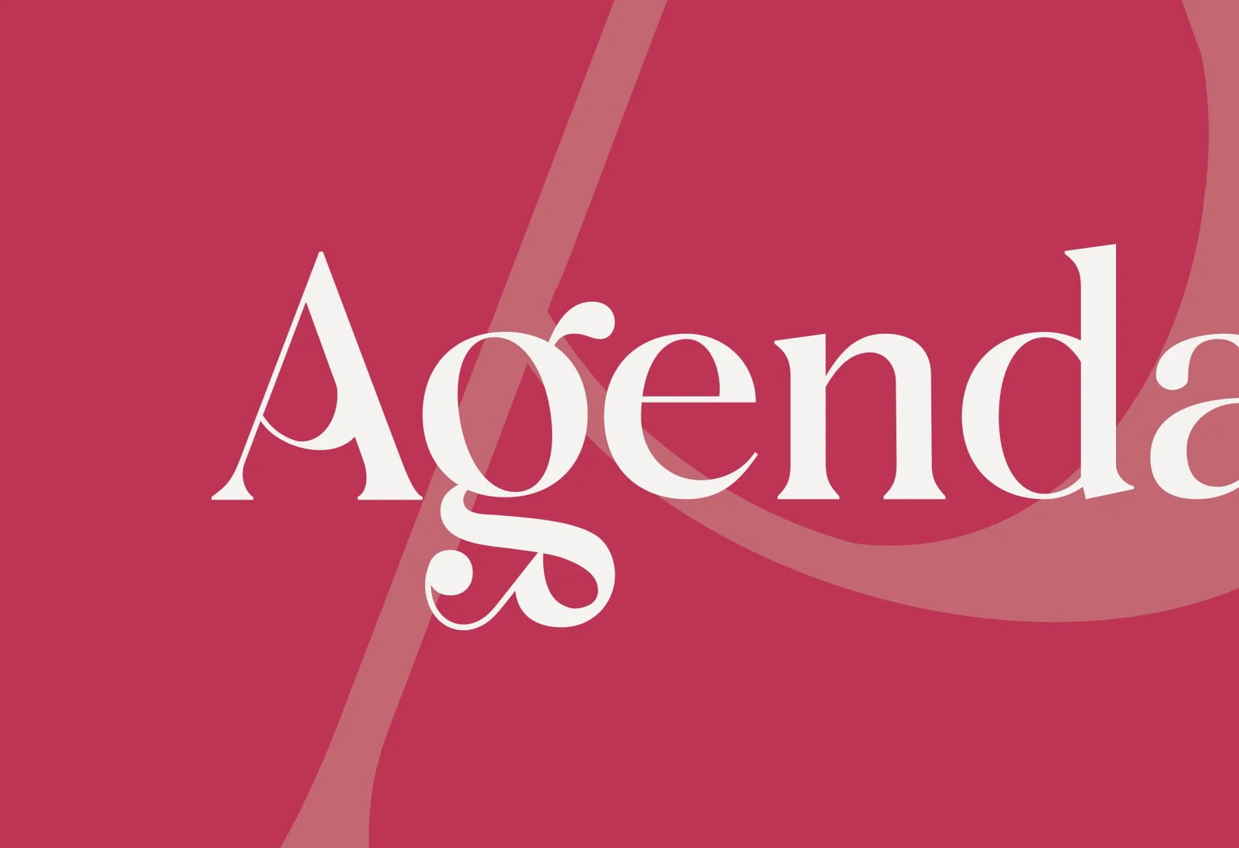
How Typography Shapes the Way People Perceive Your Brand
Typography is often treated as a finishing touch.
Something chosen after the logo, colours, and layout are already in place. In reality, it’s one of the first things people react to, even if they don’t consciously notice it.
Before someone reads your message, they experience how it looks.
That experience shapes whether your brand feels credible, modern, premium, or unclear. The words might be strong, but if the typography works against them, the perception changes instantly.
Key Takeaways
Typography influences how people perceive your brand before they consciously read any messaging, shaping whether the business feels modern, premium, trustworthy, technical, or unclear.
Strong typography systems improve readability, reduce friction, and help users absorb information more easily across websites, marketing materials, and digital platforms, which directly affects trust and engagement.
Consistent typography across websites, social content, presentations, and branding materials helps build recognition over time by making the brand feel more cohesive and visually connected.
Effective typography should function as a structured brand system rather than a decorative choice, balancing personality, usability, spacing, hierarchy, and clarity across real-world applications.
It Communicates Personality Without Saying Anything
Every typeface carries a tone.
Not in an abstract sense, but in a way people instinctively understand. Some fonts feel structured and formal, others feel open and contemporary. Some feel technical, others more expressive.
This is where typography starts influencing perception.
A structured serif typeface can suggest reliability and heritage, often associated with more traditional industries. A clean sans-serif tends to feel more modern and accessible, which is why it’s widely used across digital-first brands.
More expressive styles can introduce personality, but they need to be used carefully. When overused or applied without structure, they can quickly shift from distinctive to distracting.
The important part is alignment.
Typography should reinforce how you want the brand to feel, not contradict it.
It Directly Affects Trust and Readability
Typography is not only about style. It affects how easily people can understand what you’re saying.
If text is difficult to read, too tight, too small, or poorly spaced, it creates effort. That effort translates into friction, and friction reduces trust.
People rarely analyse this consciously. They simply feel that something is off.
Clear, well-structured typography does the opposite. It makes content easier to process, which makes the brand feel more considered and more reliable.
This is particularly important in web design & development, as users are scanning pages rather than reading content in detail. If they can’t absorb information quickly, they move on.
Good typography removes that barrier.
Consistency Builds Recognition Over Time
Typography is one of the most repeatable elements of a brand.
Unlike imagery or layout, which can change more frequently, type tends to stay consistent across different touchpoints. That consistency is what builds recognition.
When the same font system appears across your website, social content, documents, and marketing materials, it creates a sense of cohesion. Over time, that becomes familiar.
When typography changes frequently, or is applied inconsistently, that cohesion breaks.
The brand starts to feel fragmented. Even if each individual piece looks fine, the overall impression becomes less clear.
A simple, well-defined type system avoids this.
Usually one primary typeface, supported by a secondary where needed, with clear rules for hierarchy and usage. That structure is what keeps everything aligned.
It Influences How People Judge Quality
Perception of quality is shaped quickly.
Typography plays a direct role in that judgement.
Well-balanced type, with clear spacing, hierarchy, and proportion, signals attention to detail. It suggests that the business is considered in how it presents itself.
Poor typography suggests the opposite.
Inconsistent sizing, awkward spacing, or mismatched styles create the impression of something unfinished or rushed. Even if the service or product is strong, that perception can undermine confidence.
This is why typography is not neutral.
It either supports your positioning or works against it.
It Shapes How Easily People Take Action
Typography doesn’t just affect how your brand identity is perceived. It also influences how people behave.
Headings guide attention. Body text carries information. Buttons and calls to action rely on clarity to be effective.
If the hierarchy is unclear, users don’t know where to look. If the text feels dense or difficult to scan, they disengage. If calls to action don’t stand out, they are ignored.
All of this impacts conversion.
Clear typographic structure makes it easier for users to move through your content, understand what’s being offered, and take the next step without hesitation.
Where Most Brands Get It Wrong
Typography is often chosen based on appearance alone.
A font is selected because it looks good in isolation, not because it works across the entire brand. This leads to issues once it’s applied in different contexts.
Another common mistake is using too many typefaces.
What starts as an attempt to create variety quickly becomes inconsistent. Without clear rules, hierarchy breaks down and the brand loses clarity.
There’s also a tendency to prioritise style over usability.
Fonts that look distinctive at first can become difficult to read at scale, especially across digital platforms. When that happens, the brand sacrifices clarity for aesthetics.
A More Effective Way to Approach It
Typography works best when it is treated as a system rather than a single choice.
Start by defining the role it needs to play. Should it feel structured or expressive, modern or established, minimal or character-driven.
From there, select a primary typeface that supports that direction. Add a secondary only if needed, and define how each will be used.
Then focus on application.
Set clear rules for headings, body text, spacing, and hierarchy in your brand guidelines. Test how it performs across different formats, not just in static designs but in real use.
This is what turns typography from decoration into a functional part of the brand.
Frequently Asked Questions
-
Most brands work best with one primary typeface and, in some cases, a secondary font for contrast or flexibility. This keeps the visual system simple and easy to apply across different platforms. Using too many fonts creates inconsistency and makes the brand feel less structured, especially as more content is produced over time.
-
Yes. Typography directly influences how easily users can read, understand, and act on your content. Clear hierarchy, proper spacing, and readable font choices reduce friction, which makes it easier for visitors to engage and move towards taking action. Poor typography can slow people down or create doubt, even if the offer itself is strong.
-
It depends on how you want your brand to be perceived. More distinctive typefaces can help create a recognisable identity, but they must remain clear and usable across all touchpoints. Safer fonts tend to be easier to apply consistently, especially for digital use. The priority should always be clarity first, then distinctiveness.
-
Yes. Consistency in typography helps reinforce recognition and makes the brand feel more stable. If fonts change between your website, social media, and documents, it creates a fragmented experience. A defined typographic structure ensures everything feels connected, even when created in different contexts.
-
Typographic hierarchy is how different text elements are structured, such as headings, subheadings, and body text. It guides the reader through the content and makes information easier to process. Without clear hierarchy, content feels cluttered and harder to follow, which reduces engagement.
-
Yes, but similar to colours, frequent changes can weaken recognition. Fonts become part of how people identify your brand over time. If a change is needed, it should be part of a considered update rather than a frequent adjustment, ensuring the brand remains consistent and recognisable.
The Voice People See First
Before anyone reads your message, they experience how it looks.
Typography is that first impression.
When it’s clear, consistent, and aligned with your brand, it supports everything you’re trying to communicate. When it’s not, it quietly works against you.
If you’re refining your brand and want your typography to reflect the right level of clarity and positioning, you can speak to one of our specialists to structure it properly rather than leaving it to chance.