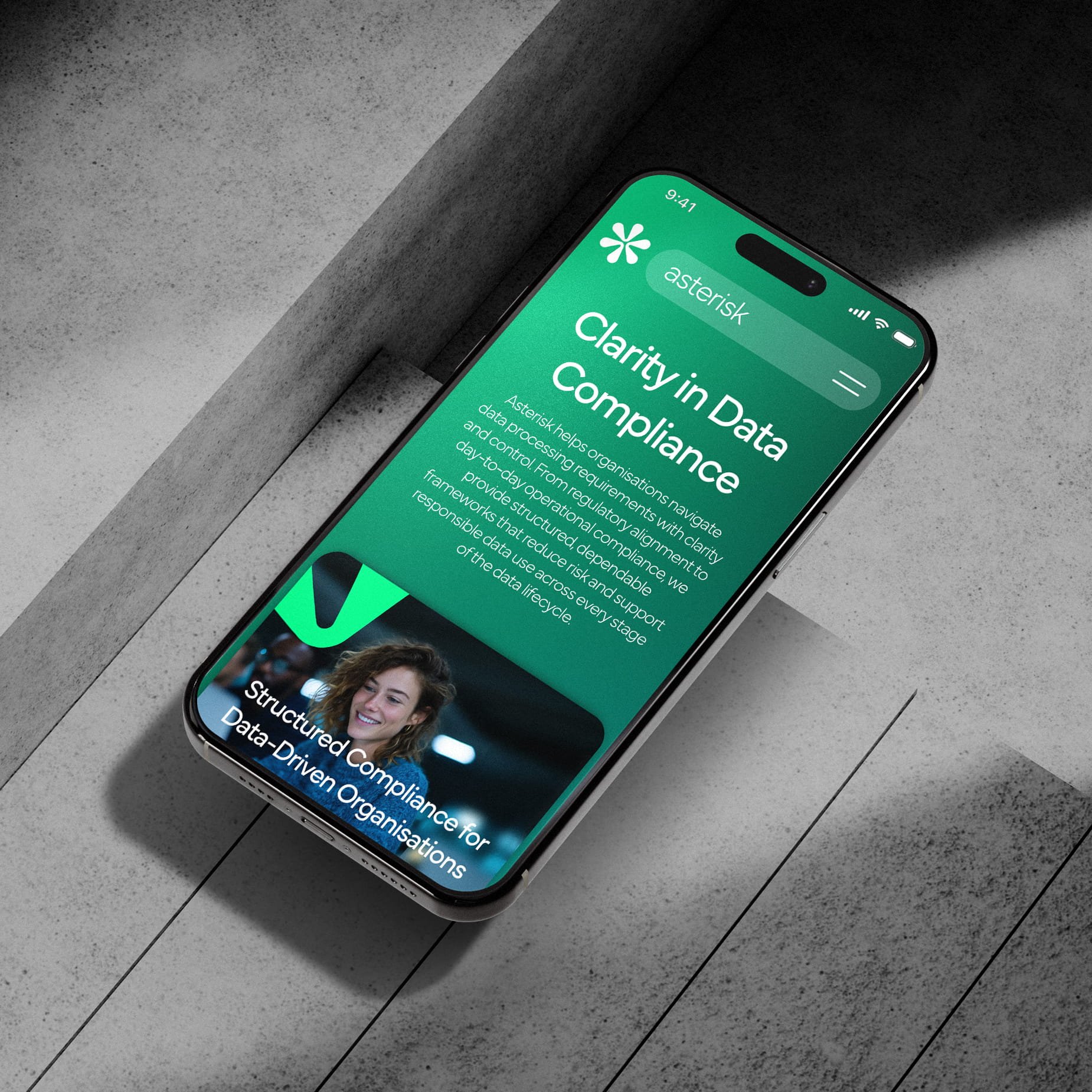
Why Your Website Looks Good But Converts Poorly
A good-looking website should work.
Clean layout, strong visuals, smooth animations, it feels like everything is in place. But then the enquiries don’t come, or they come inconsistently, and it’s not clear why.
The issue is rarely design quality. It’s what the design is built around.
Most low-converting websites are designed to impress, not to guide. They look polished, but they don’t answer the right questions quickly enough, or lead people clearly towards action.
That gap is where conversion is lost.
Key Takeaways
A visually impressive website does not automatically convert visitors into enquiries, because conversion depends more on clarity, structure, trust, and user guidance than on appearance alone.
Most low-converting websites fail to communicate value quickly enough, leaving visitors unsure what the business does, who it helps, or why they should take action within the first few seconds.
Strong conversion-focused websites build trust early through testimonials, case studies, recognisable clients, measurable results, and strategically placed proof points that reduce hesitation near key decision-making areas.
Friction points such as unclear calls to action, slow mobile performance, overly complex forms, distracting animations, weak messaging, or broad positioning often reduce conversions quietly, even when the overall website design feels modern and professional.
Your Value Isn’t Clear Fast Enough
The first few seconds decide everything.
When someone lands on your website, they’re not analysing the design. They’re trying to understand one thing, whether they’re in the right place.
If your homepage doesn’t immediately explain who you help, what you do, and why it matters, hesitation kicks in. And hesitation leads to exits.
This often happens when copy is written to sound clever or on-brand rather than clear. It looks good, reads nicely, but doesn’t guide the user.
Strong websites remove that ambiguity instantly. The headline tells the visitor exactly what the business does, who it’s for, and what they can do next, without needing to scroll or interpret.
Clarity here is not a detail. It’s the foundation of conversion.
You’re Not Building Enough Trust Early
A visually strong site can still feel risky.
If someone is considering a service, especially a higher-value one, they are looking for reassurance. They want to know that others have trusted you, that results have been delivered, and that choosing you is a safe decision.
If that proof is missing, or hidden too far down the page, doubt remains.
This is where many websites underperform. They rely on design to create confidence, but design alone doesn’t remove risk.
Trust is built through evidence. Case studies, testimonials, recognisable clients, or specific results all contribute to that.
Placed correctly, near key decision points, they reduce hesitation and move the user forward.
There’s No Clear Path to Action
A website should guide, not present options.
Many visually strong sites fail here because they try to do too much at once. Multiple calls to action, competing sections, and unclear hierarchy create confusion.
From the user’s perspective, it’s simple. If the next step isn’t obvious, they won’t take it.
This doesn’t always look like a problem. The design may feel balanced, even sophisticated. But without a clear primary action, users default to doing nothing.
High-converting websites remove that ambiguity. Each page has a clear purpose, and each section supports a single direction.
The call to action stands out, both visually and in how it’s written. It tells the user exactly what they get by clicking, not just what the button says.
Friction Is Hidden in the Details
Some of the biggest conversion issues are not visible at first glance.
A form that asks for too much information. A mobile experience that feels slightly slow. A missing phone number when someone wants quick contact. Pricing that is unclear or absent.
Individually, these seem small. Together, they create resistance.
Users don’t usually analyse these points. They feel them. If something feels inconvenient or uncertain, they leave.
Design can sometimes make this worse. Heavy animations, background videos, and layered effects may look impressive, but they can distract from the actual purpose of the page.
High-performing websites simplify. They remove anything that slows the user down or makes the next step less obvious.
You’re Attracting the Wrong Audience
A website can be well designed and still perform poorly if it’s speaking to the wrong people.
This often comes from broad positioning. Trying to appeal to too many audiences at once leads to generic messaging that doesn’t connect strongly with anyone.
From an SEO perspective, this also creates a mismatch. If your page ranks for a keyword, but the content doesn’t align with what the user expects, they leave quickly.
That behaviour feeds back into performance. Lower engagement signals tell search engines the page isn’t the right fit, which can affect both rankings and conversions over time.
Improving this requires focus. Each key page should be built around a specific intent, a specific audience, and a specific outcome.
The clearer that alignment is, the stronger the conversion.
Why It Feels Like the Design Isn’t Working
When a site looks good but doesn’t convert, it’s easy to blame the design.
In reality, the design is often doing exactly what it was asked to do. It just wasn’t built around the right priorities.
You might have strong visuals, but unclear messaging. A clean layout, but no defined user journey. A premium look, but no proof to support it.
Each part works on its own. Together, they don’t support conversion.
That’s why the issue feels difficult to pinpoint. Nothing looks obviously wrong, but the results don’t follow.
Where Most Businesses Get It Wrong
The mistake is treating design and conversion as separate things.
A website is not just a visual asset. It’s a tool that should guide behaviour.
When branding, messaging, and structure are not aligned, the site becomes passive. It looks good, but it doesn’t move people forward.
Fixing this is not about redesigning everything. It’s about reworking how the site communicates, what it prioritises, and how it leads users from one step to the next.
That’s where structured website strategy and conversion-focused design becomes important. Not just making the site look better, but making it work properly.
A Practical Way to Improve Conversion
If your site isn’t converting, start with a focused review rather than a full rebuild.
Look at your key pages, the ones that receive the most traffic or should generate the most enquiries.
Check whether the value is clear immediately. Whether trust signals are visible early. Whether the next step is obvious and easy to take.
Then look at friction. Forms, speed, mobile experience, anything that might slow the user down.
Small, targeted changes in these areas often have a bigger impact than a complete redesign.
Frequently Asked Questions
-
Only if the underlying problems are addressed. A new design on its own rarely changes performance. If messaging is unclear, structure is weak, or the user journey is confusing, those issues will carry through into the new version.
-
In many cases, quickly. Improvements to clarity, stronger value positioning, better calls to action, and clearer page structure can lead to immediate changes, especially on pages that already receive consistent traffic.
-
Analytics help confirm patterns, but they are not always necessary to spot core issues. If the offer is unclear, the audience is not obvious, or the next step is difficult to find, those are already conversion barriers.
-
Lack of clarity. Visitors cannot quickly understand what the business does, who it is for, or why it matters. Even strong visuals cannot compensate for unclear messaging.
-
Yes. Testimonials, case studies, recognisable clients, and clear contact details reduce hesitation. Without these, visitors have less reason to feel confident in taking the next step.
-
Not always directly. Some pages are informational and support the overall journey. However, every page should guide the visitor somewhere, whether that is towards a service page, contact point, or deeper content.
Clarity Converts, Design Supports
A good-looking website attracts attention.
A clear, structured website turns that attention into action.
The difference is not how it looks, but how it guides.
If your site feels strong visually but isn’t delivering results, the issue is rarely the design itself. It’s what sits behind it.
If you’re based in London, Essex, or surrounding areas and want to understand where your website is losing conversions, you can speak to us to get a clear breakdown of what to fix and how to improve it.