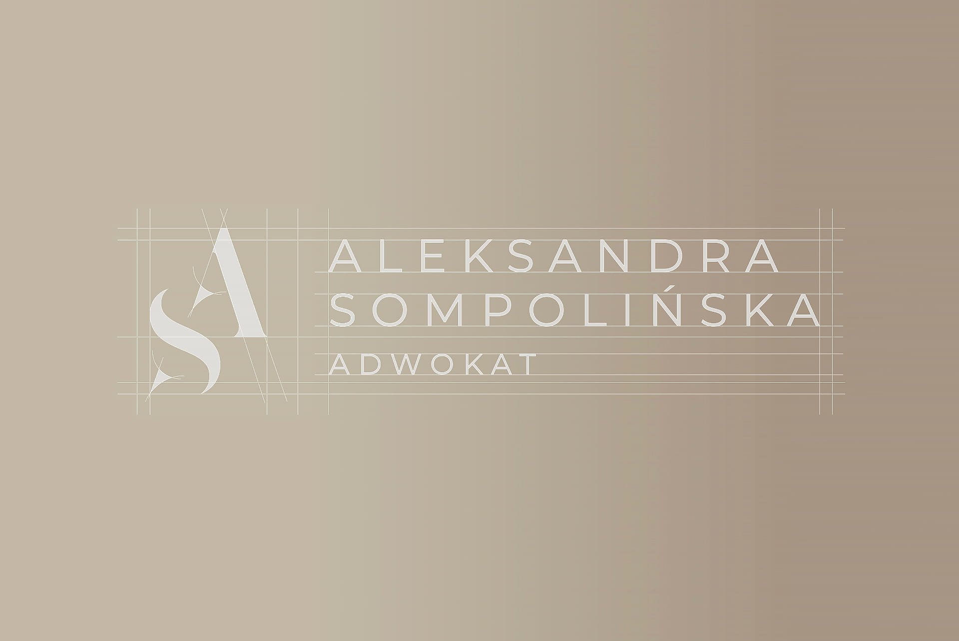
Aleksandra Sompolinska Solicitors Branding & Web Design
Establishing a clear and professional presence
The brand identity and website were developed to reflect trust, clarity, and professionalism. Every element, from visual language to structure, was defined to ensure the practice is understood quickly and presented with consistency across digital and client-facing touchpoints.
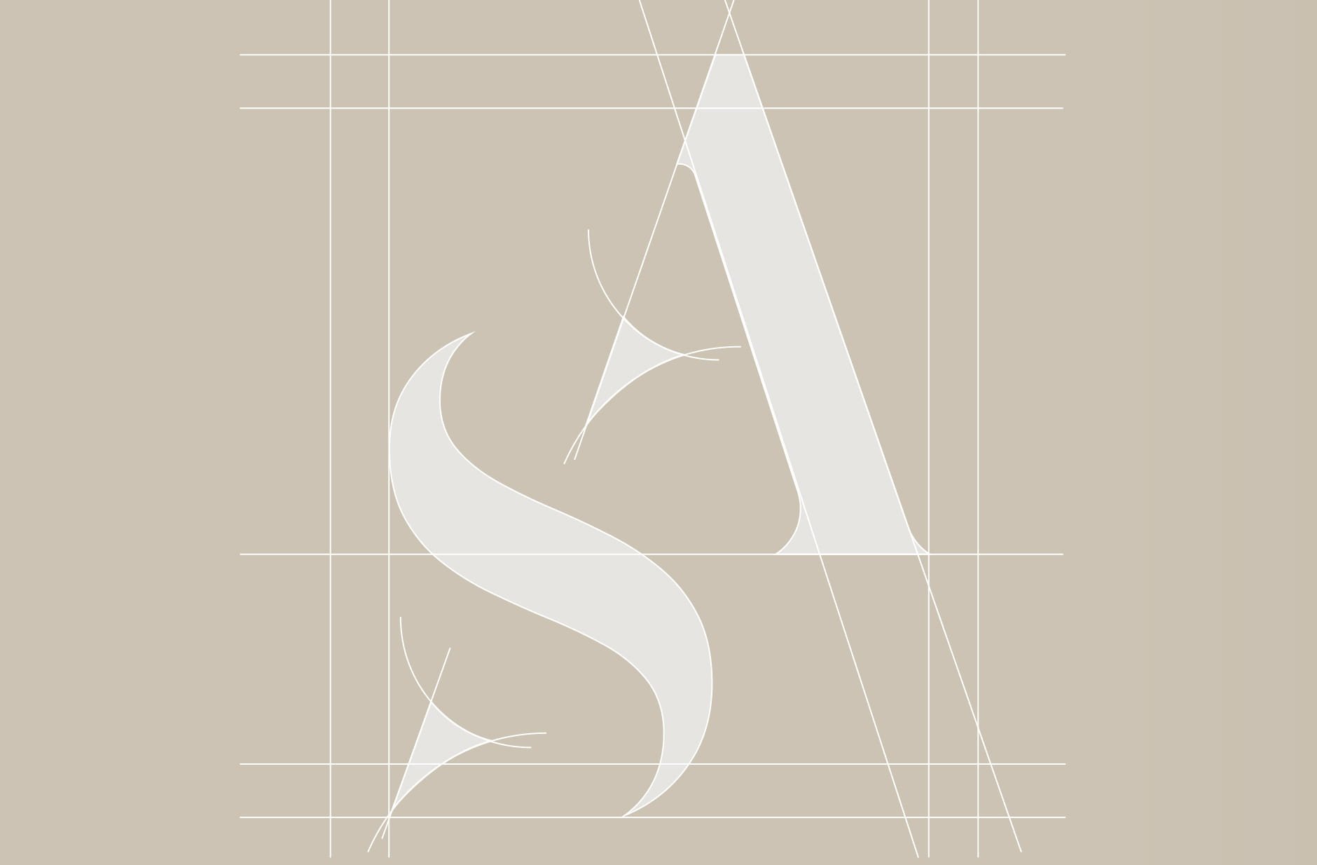

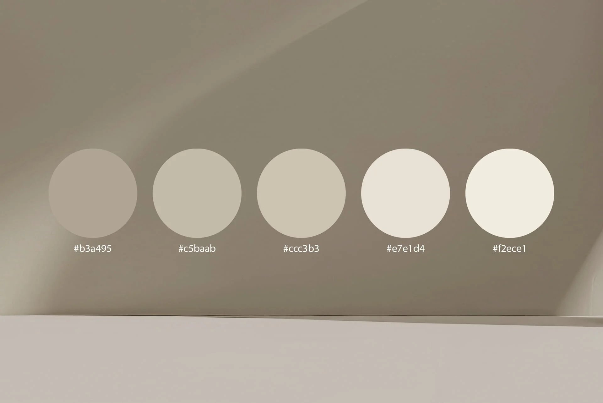
A restrained palette built on trust
The colour system was defined to move away from the typical greens and blues often used in the legal sector. Neutral tones combined with muted gold accents create a more refined and distinctive presence, reinforcing professionalism while setting the practice apart through a calmer, more considered visual direction.


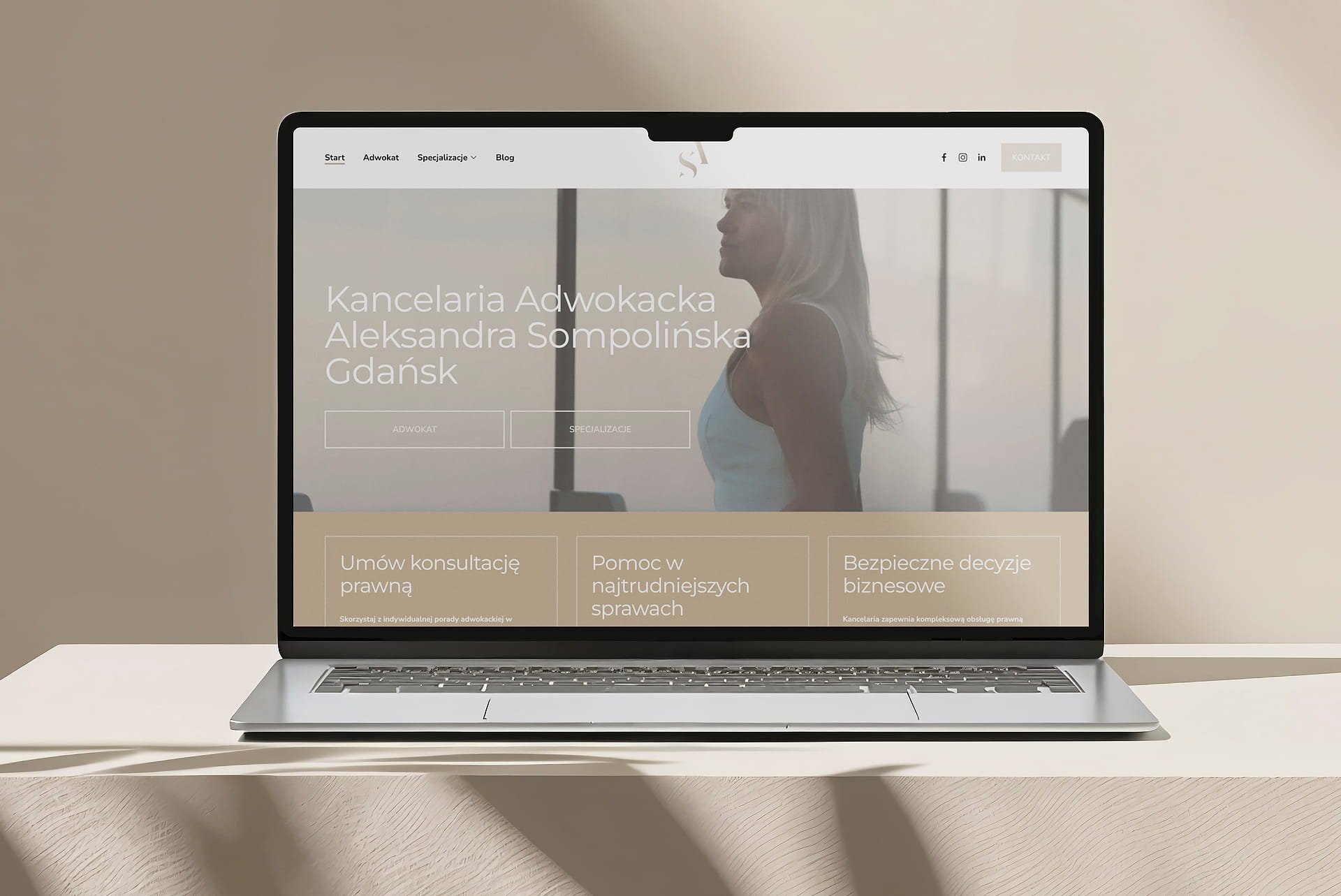
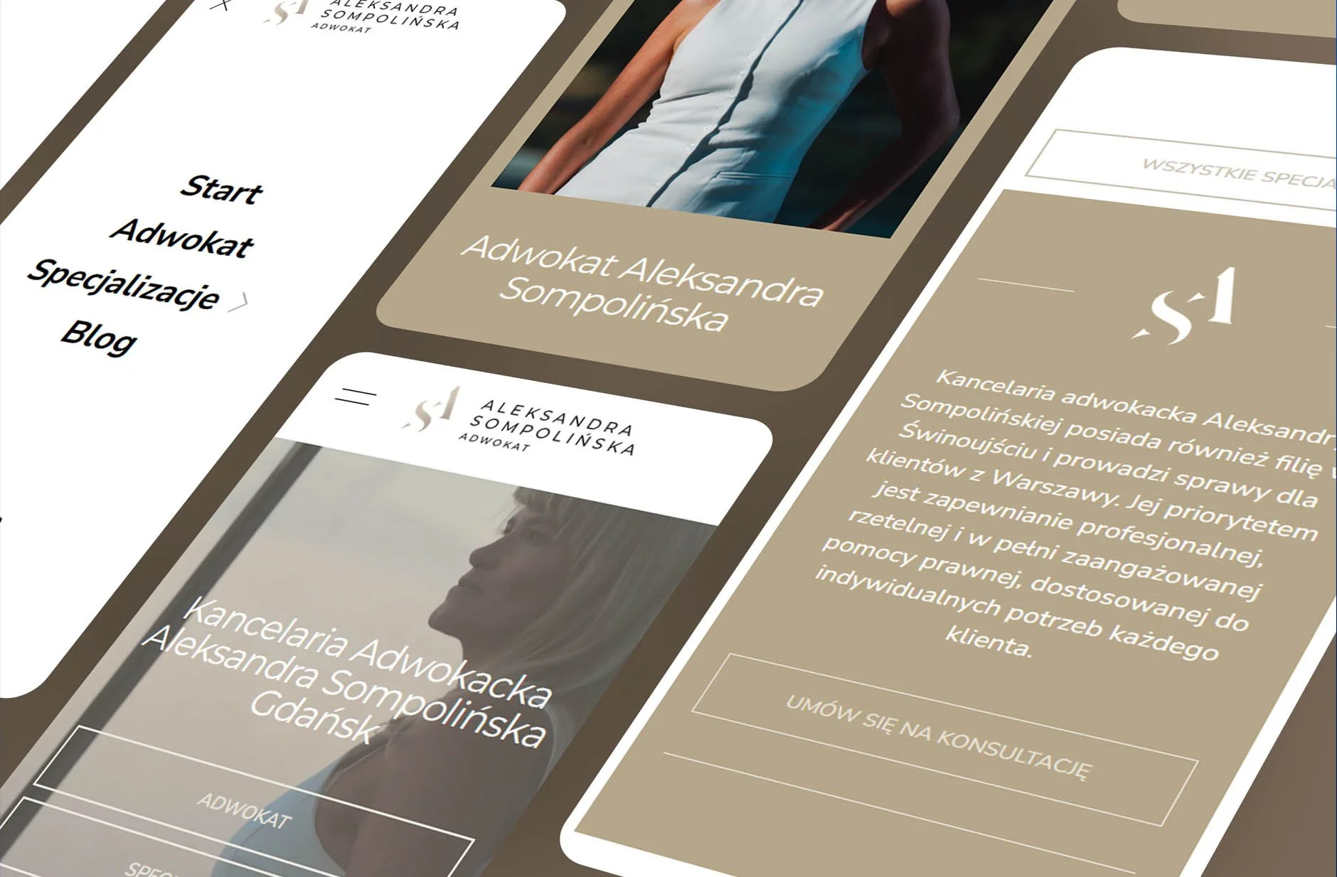
Designed to guide and inform clearly
The website was structured to make legal services accessible and easy to navigate. Clear hierarchy, defined sections, and focused content allow users to find relevant information quickly, supporting confident decision-making and a straightforward user experience.
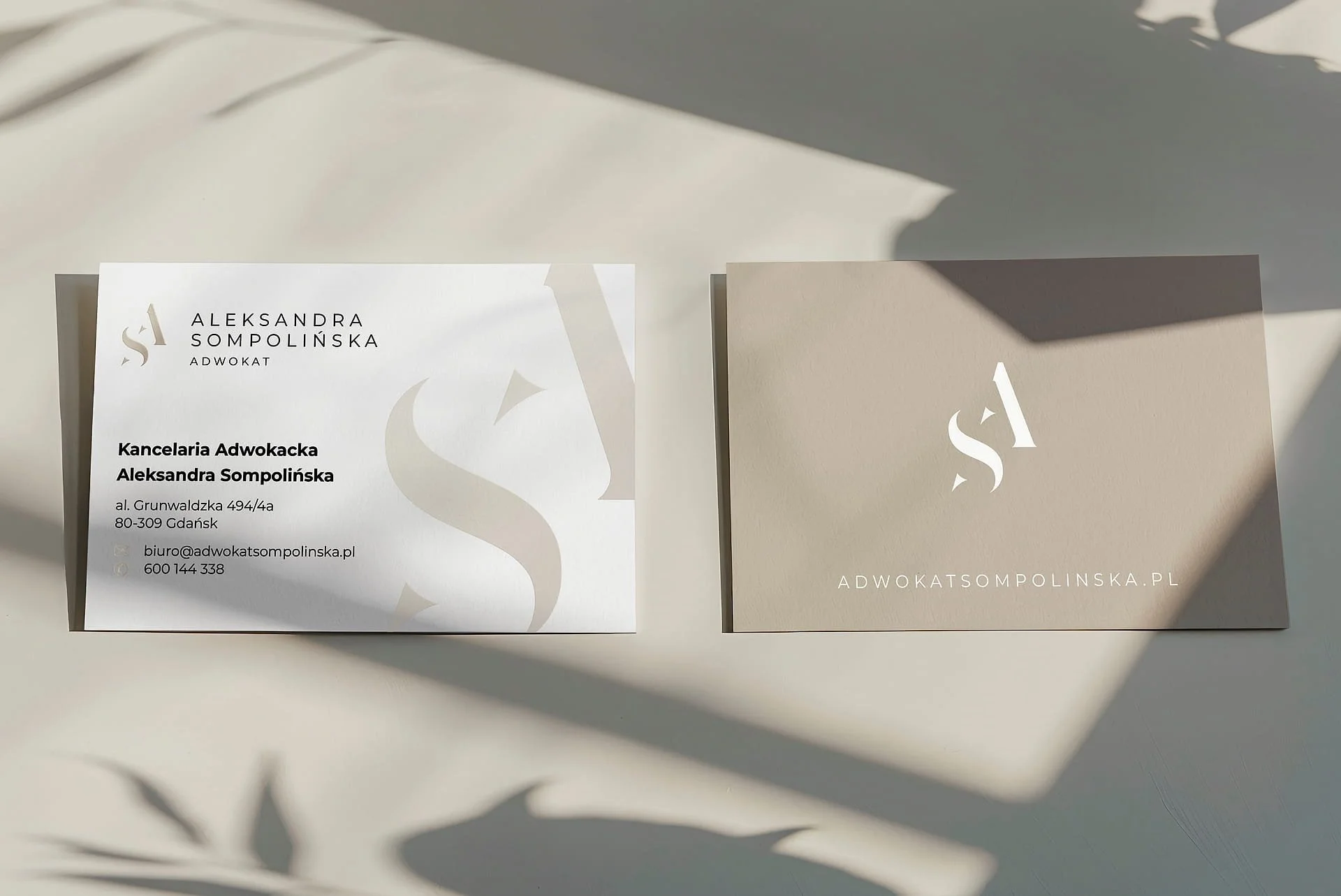
Extending identity into real-world presence

The brand identity was applied across physical touchpoints to maintain consistency beyond digital. Controlled use of typography, colour, and layout ensures the practice is recognised clearly, supporting a professional and cohesive presence in client-facing environments.
A complete identity built for consistency
The result is a unified brand system combining identity and website design into a clear, practical structure. Each element supports recognition, strengthens trust, and ensures the practice is presented consistently across digital platforms and real-world interactions.
Our other projects
Explore more projects and see how brand identity, website design, and real-world application come together across different industries and environments.


Let’s have
a chat
Like what you see? Talk us through your idea, and we’ll help shape how it can be developed and applied.