Elvik Water Brand Identity & Packaging Project Concept
Defining a colder, more controlled identity
Elvik reframes water as something precise and considered rather than everyday. The identity focuses on clarity, depth, and temperature, shaping how the product is perceived across packaging, digital presence, and physical display.
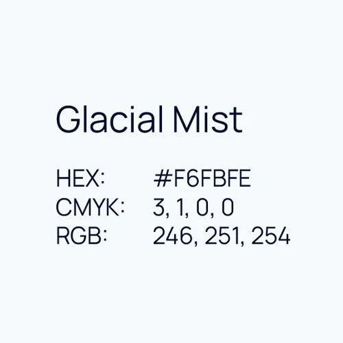
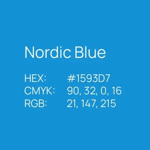
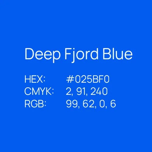
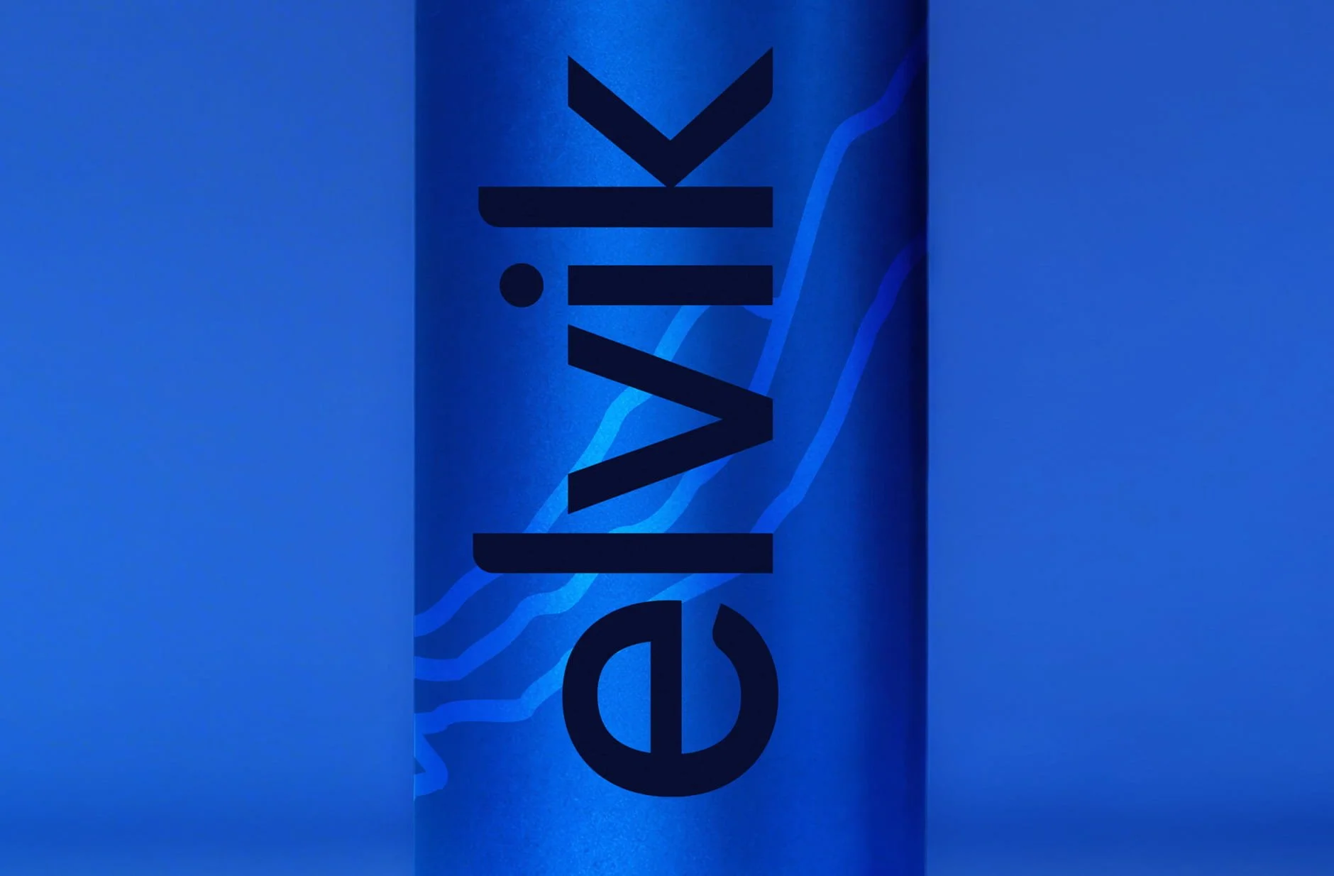
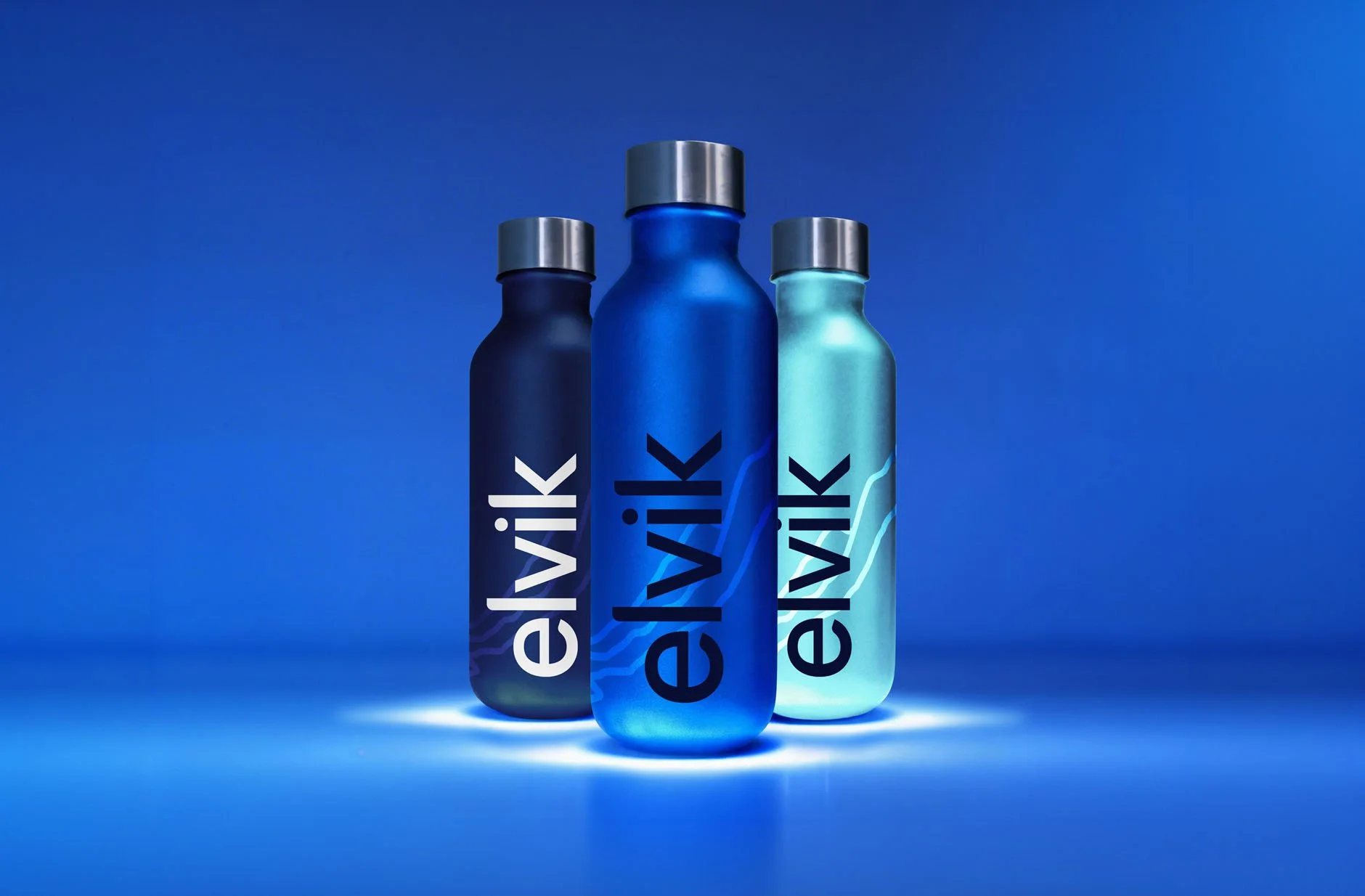
Four colours.
One world.
The palette draws from glacial environments, using layered blues to reflect temperature, purity, and movement. Controlled gradients introduce variation without disrupting clarity, allowing the brand to remain consistent while adapting across surfaces and formats.
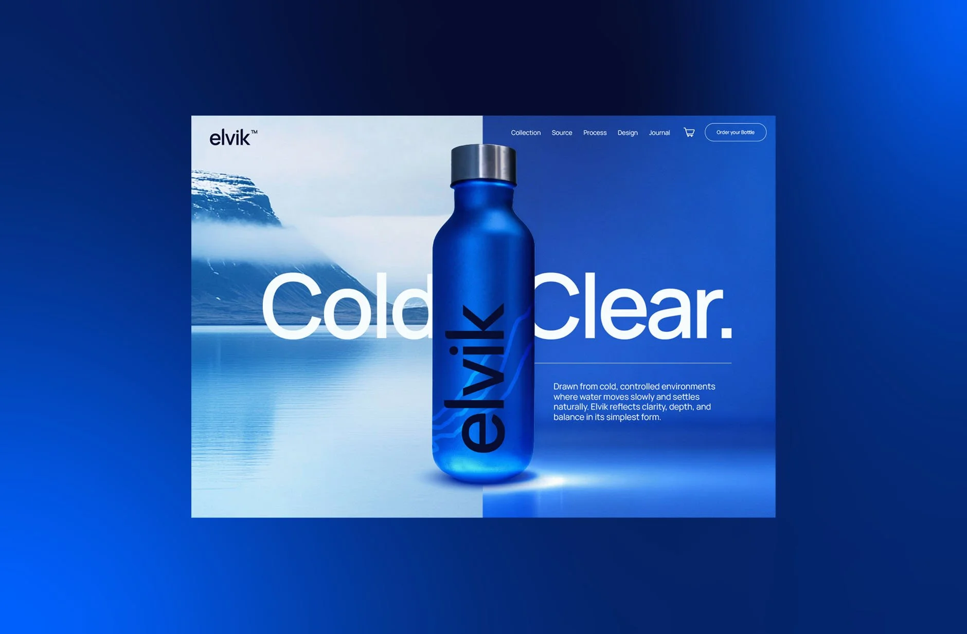
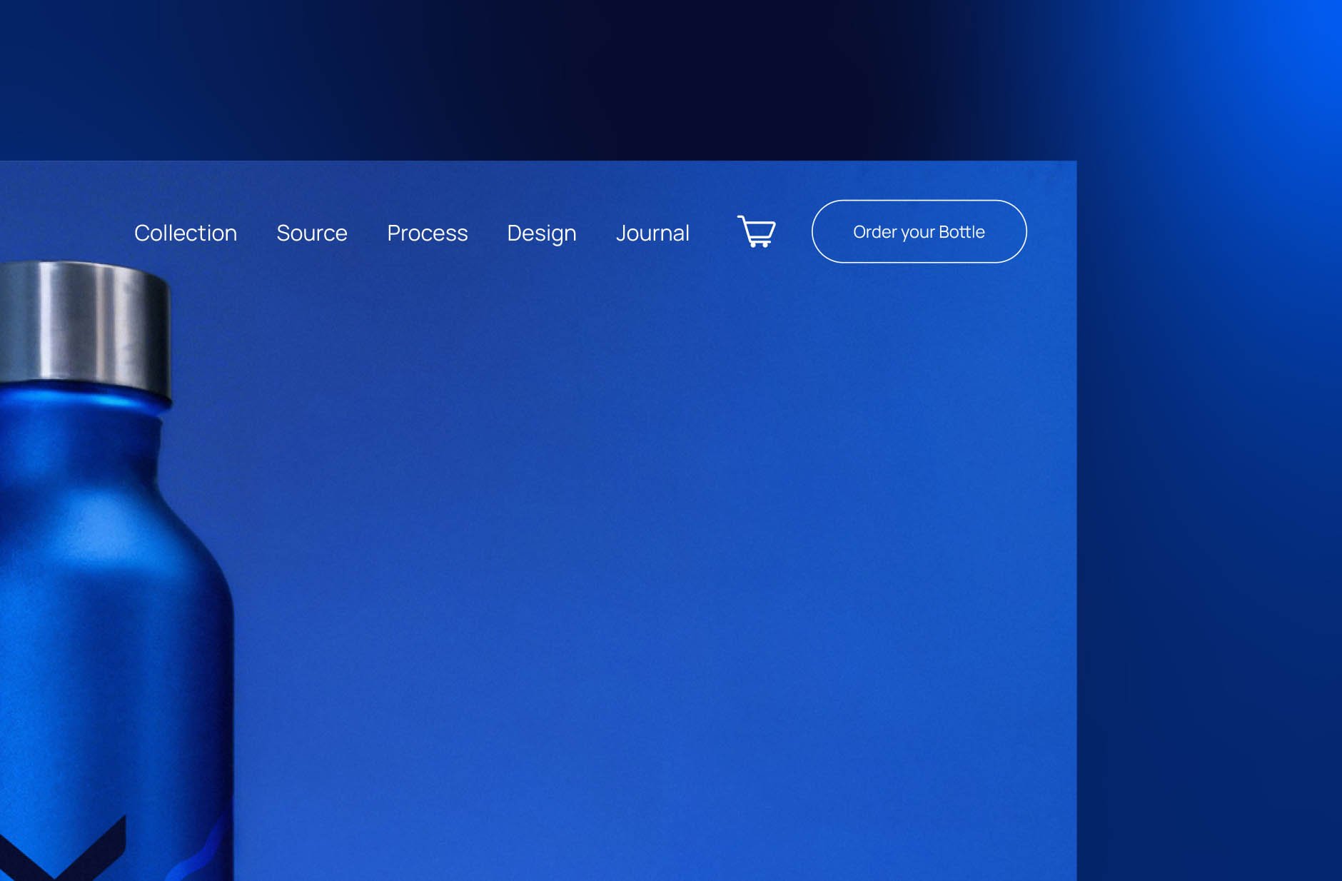
Digital experience shaped around focus
The website is structured to keep attention on the product, using scale, contrast, and minimal layout. Content is reduced to what matters, allowing users to understand quickly while reinforcing the brand’s controlled and refined positioning.
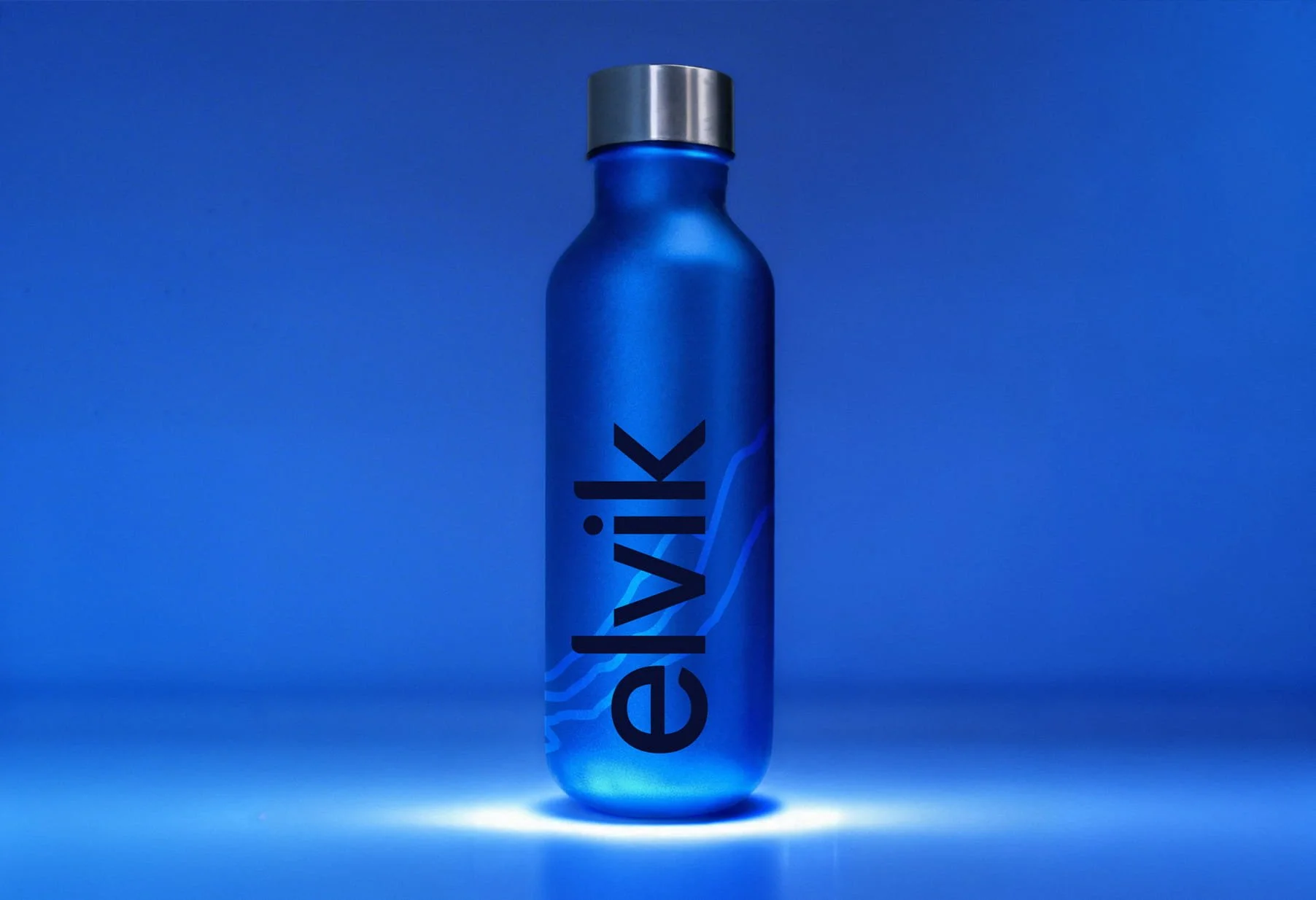
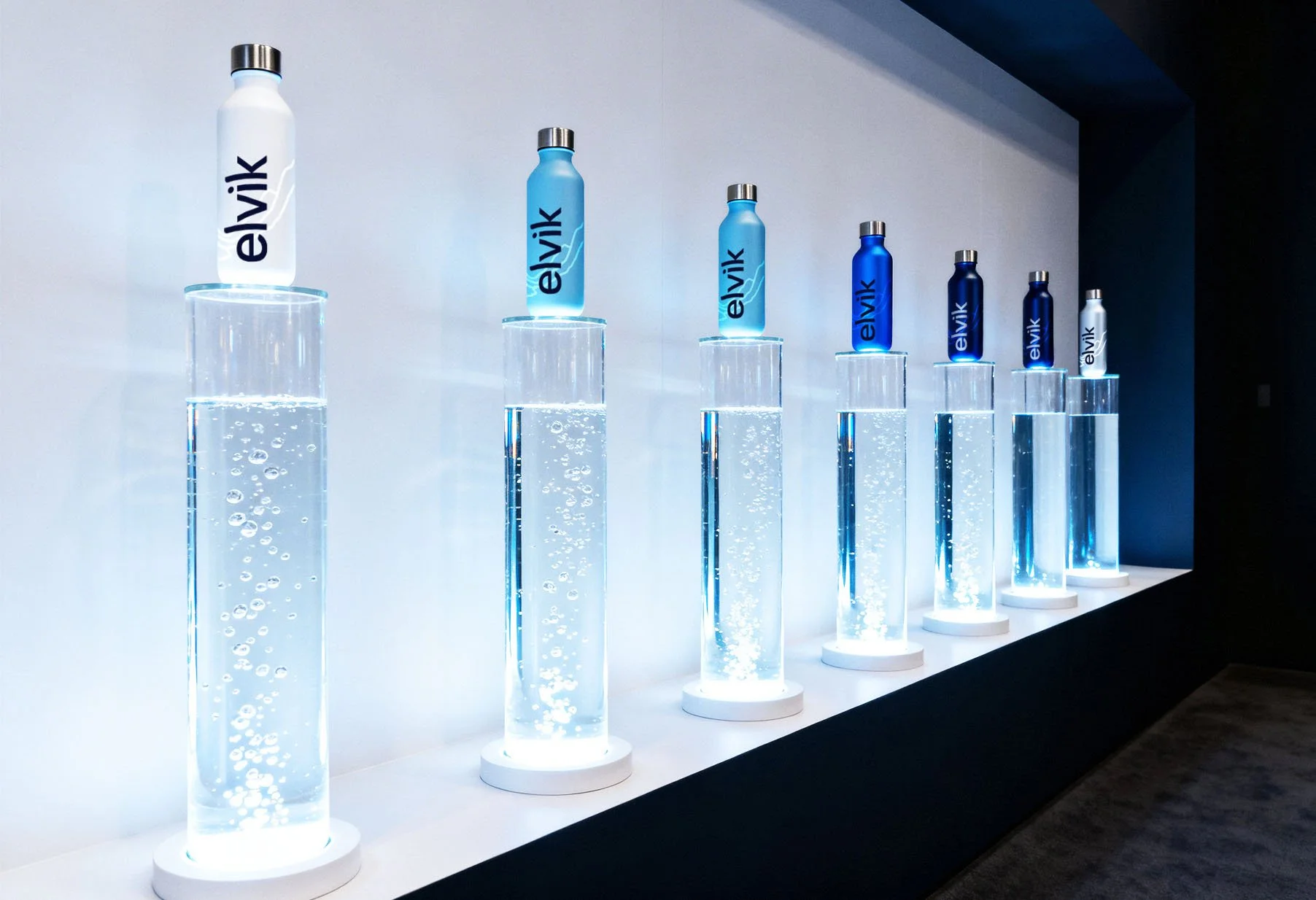
Elevating product through controlled display

The physical environment presents the product as a focal object, using light, transparency, and repetition. Each element reinforces purity and precision, creating a setting where the product feels isolated, intentional, and clearly defined.
A system built on clarity and restraint
The identity works consistently across product, digital, and environment, using minimal elements to maintain recognition. Depth of colour and controlled composition elevate perception, positioning the brand beyond commodity into a more considered, premium space.

Our other projects
Explore more projects and see how brand identity, website design, and real-world application come together across different industries and environments.


Let’s have
a chat
Like what you see? Talk us through your idea, and we’ll help shape how it can be developed and applied.